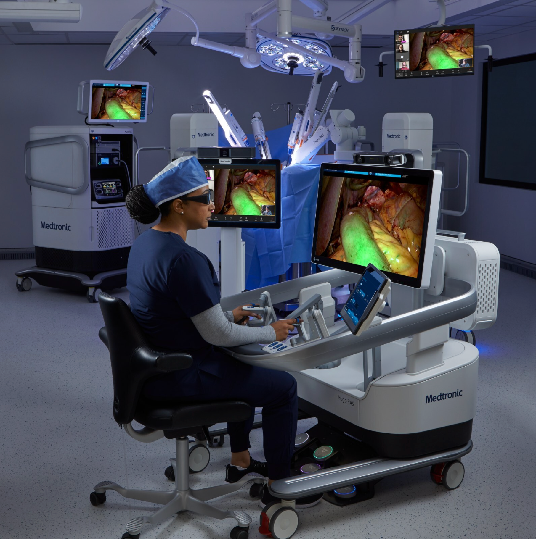
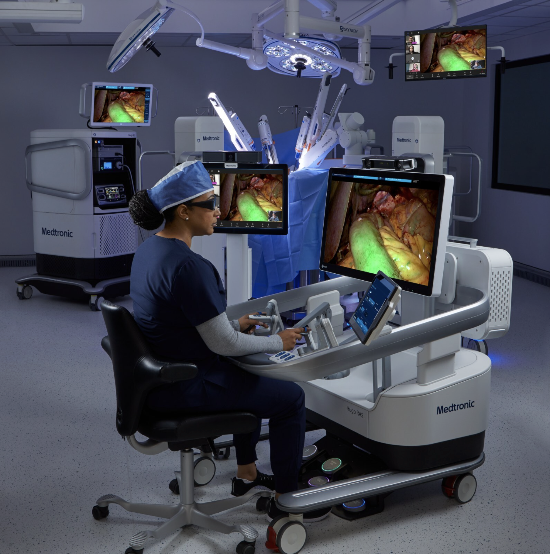
HUGO RAS
4 Screens, 6 Robotic Components
5 Personas: Physician, PA, Bedside staff, Circulating nurse, Anesthesiologist
Re-leveling Hugo’s alarm architecture
My Role
I led UX design and research strategy on this project end-to-end — from the field research that surfaced the problem, through interaction and UI design, to the cross-functional strategy that got Clinical Safety and engineering to co-own the outcome.
problem
Design an alert system that users can trust and act on at a glance, keeping them focused on the task rather than the interface.
I repeatedly observed physicians dismissing critical alerts on Hugo RAS almost the instant they appeared. Two problems compounded each other.
The alerts were written in engineering language, not surgeon language — e.g., “calibration variance on joint J” — at a glance, a surgeon couldn't tell what it meant for the procedure.
Even when they could tell, it didn't matter: if the robot let them keep operating, they would, regardless of what the alert was warning them about.
The only alerts that reliably got attention were the ones that forced a hard stop — so in practice, priority was being set by whether the system physically stopped, not by actual clinical severity.
Fixing this took two connected efforts. The first rewrote what the alerts said. The second and larger effort re-leveled how the system decided alert priority in the first place. This was only possible after a later software release gave the robot the ability to self-repair certain errors.
What had to change
Chunking the work into a two-pronged approach let the team focus and move fast.
I needed to audit and translate 265 engineering-language notifications into alerts surgeons could translate in real time, without asking the project team to fund a costly full-system alert priority rebuild upfront. Next, when Hugo’s Arm Self-Test launched—adding auto-recovery and self-test logic that let the system resolve inoperable errors without a full restart—I needed to revisit the priority model we had previously been unable to change. An alarm that once always halted the procedure could now clear in seconds, so every arm-related alarm had to be re-leveled to reflect the robot’s actual recovery path in a way Clinical Safety would support. Either failure would create a patient-safety risk the FDA could flag: burying a truly critical alert, or flooding surgeons and staff with noise that they learned to ignore.
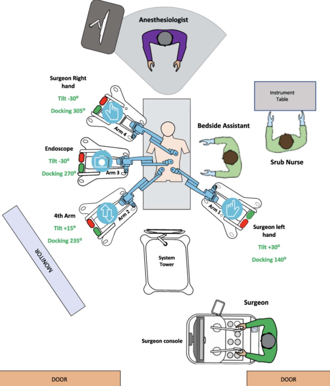
User map
Alerts affect the entire OR team and must be considered
the approach
From live-procedure research to a redesigned alert system
Part 1 I shadowed live and mock procedures to observe alert-response behavior directly rather than relying on reported feedback. I audited all 265 high-level notifications and re-categorized them around the surgeon's real-time decision-making process instead of the system's internal architecture, reducing the set to 32.
When I brought the case to the core team, the pushback was about scope, not merit — remapping and renaming 265 notifications would take a team of three to five systems engineers. Rather than ask for the full redesign upfront, I partnered with the roadmap manager to find where it could fit and started with the low-hanging fruit: the most frequently triggered alerts based on telemetry from16,429 procedures. We remapped roughly the first 30 down to 4, tested them at zero risk, and saw an immediate improvement in clarity and a measurable drop in OR noise. Once the team saw how much cleaner it made things, they were bought in.
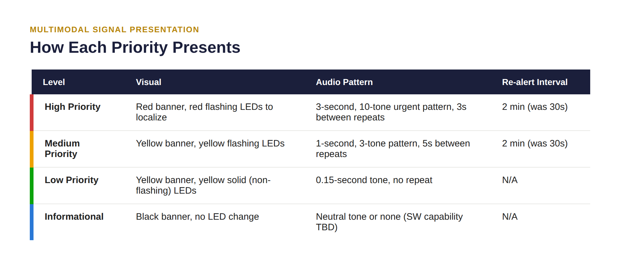
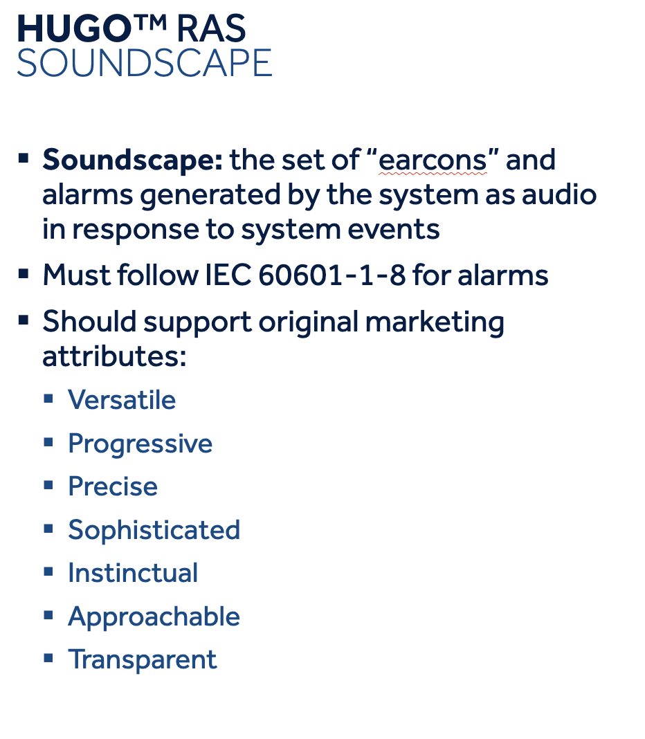
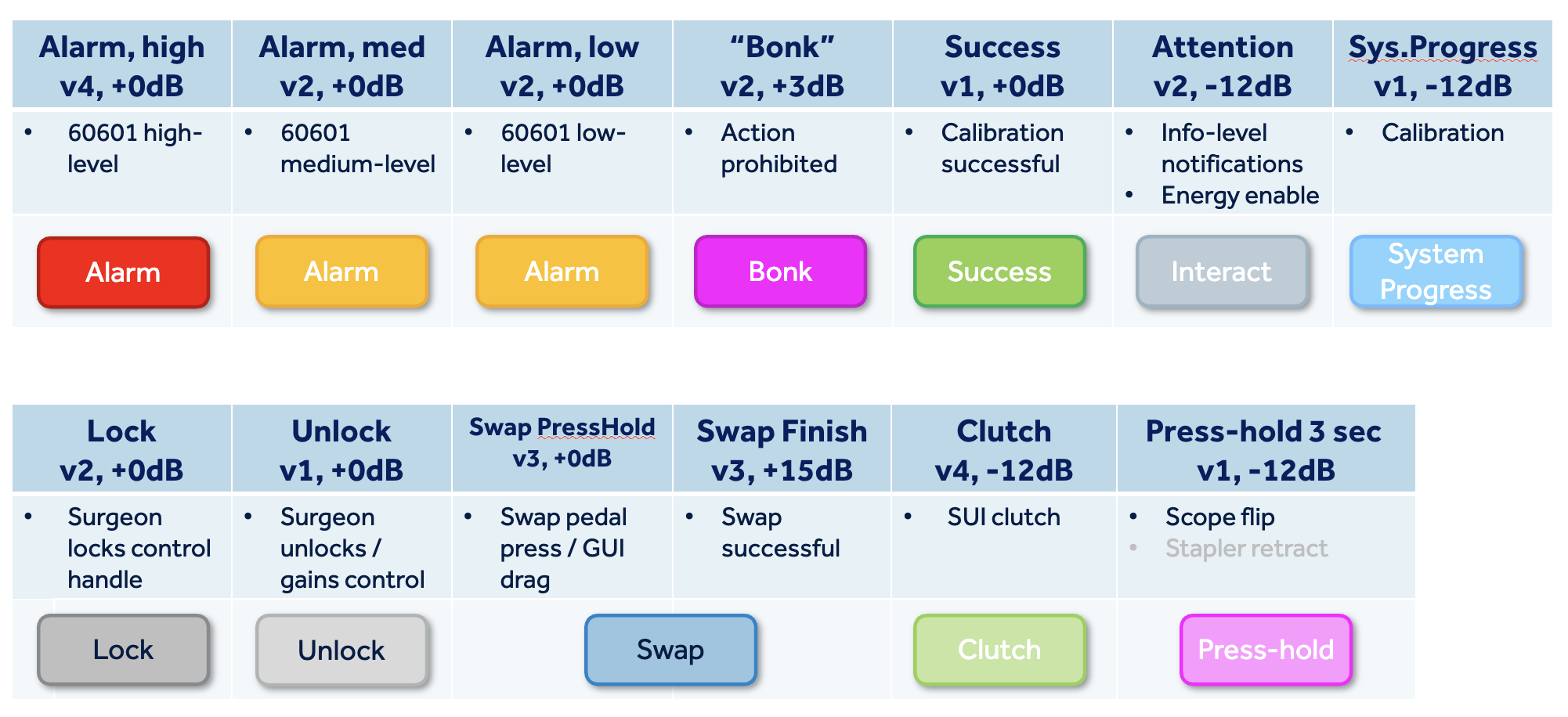
From there, I designed an escalating, multimodal notification system — haptic, light, sound, and UI — where minor issues surface briefly and fade if resolved, while only genuinely critical issues remain persistent. The work generated two patents and became the reference model for how notification systems are designed across other Medtronic OR products.
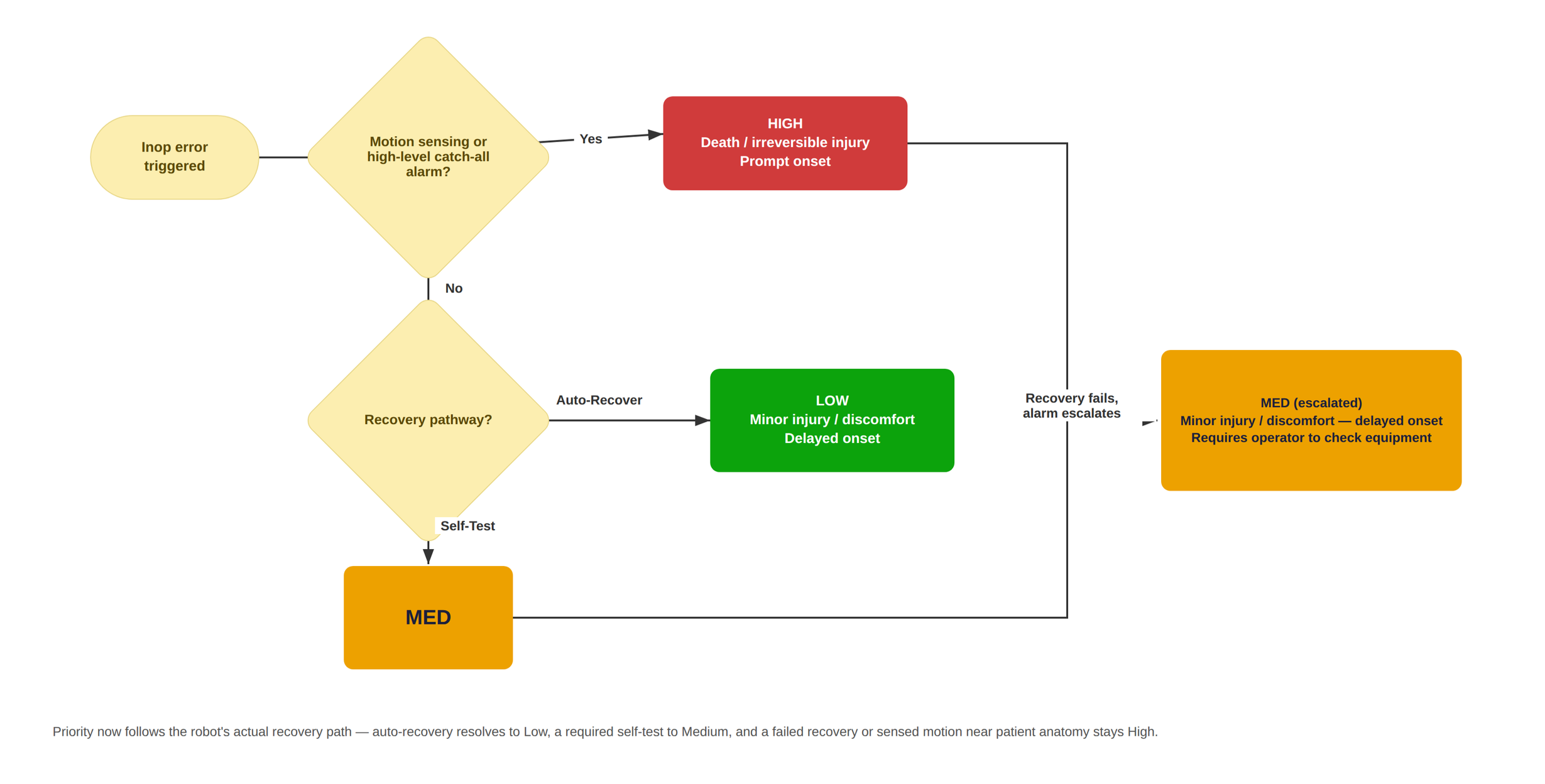
Part 2 From there, I built a decision tree with Clinical Safety and System Engineering around what Arm Self-Test actually does: if an alarm resolves through auto-recovery, it's Low, no interaction required. If it needs a self-test, it's Medium. If recovery fails and the system has to escalate, or the alarm involves sensed motion near patient anatomy, it stays High. Priority now follows the robot's real recovery path instead of a static label written before that logic existed.
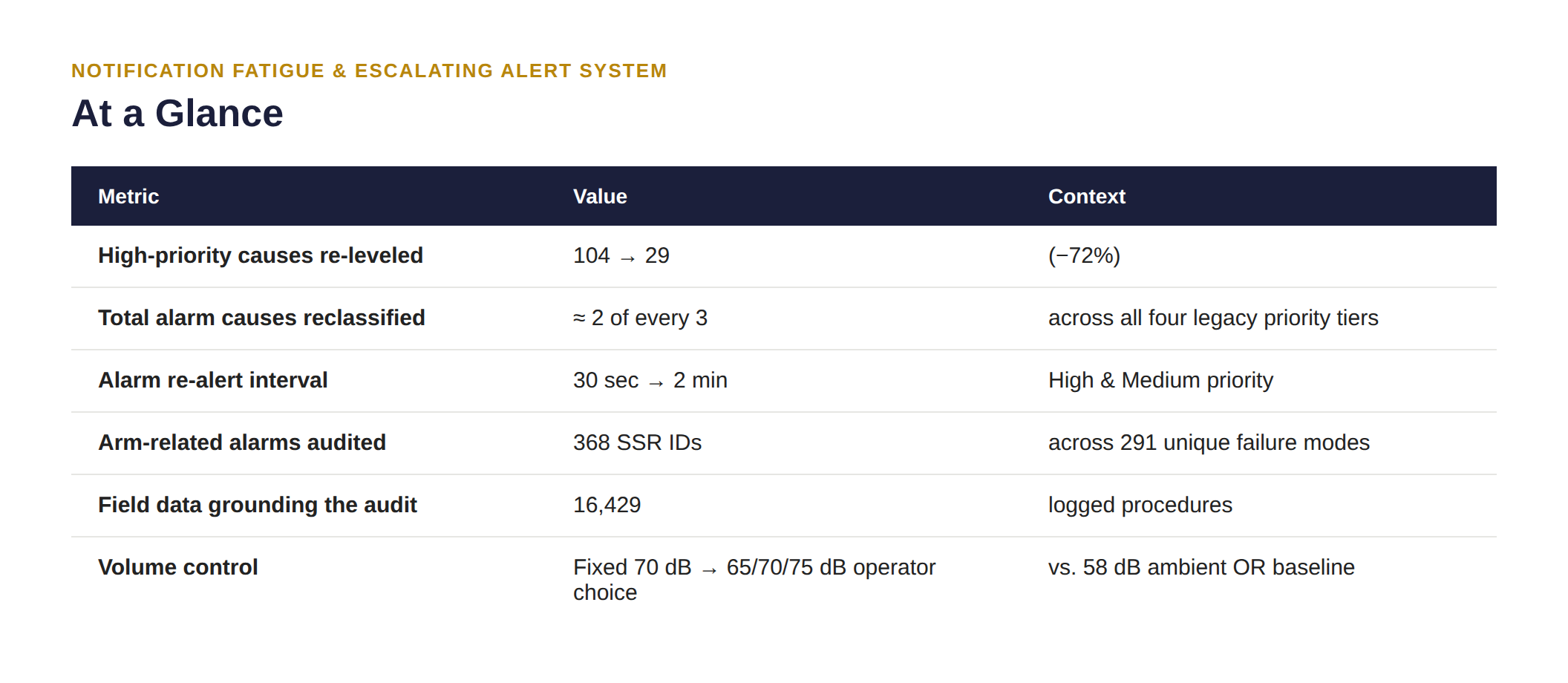
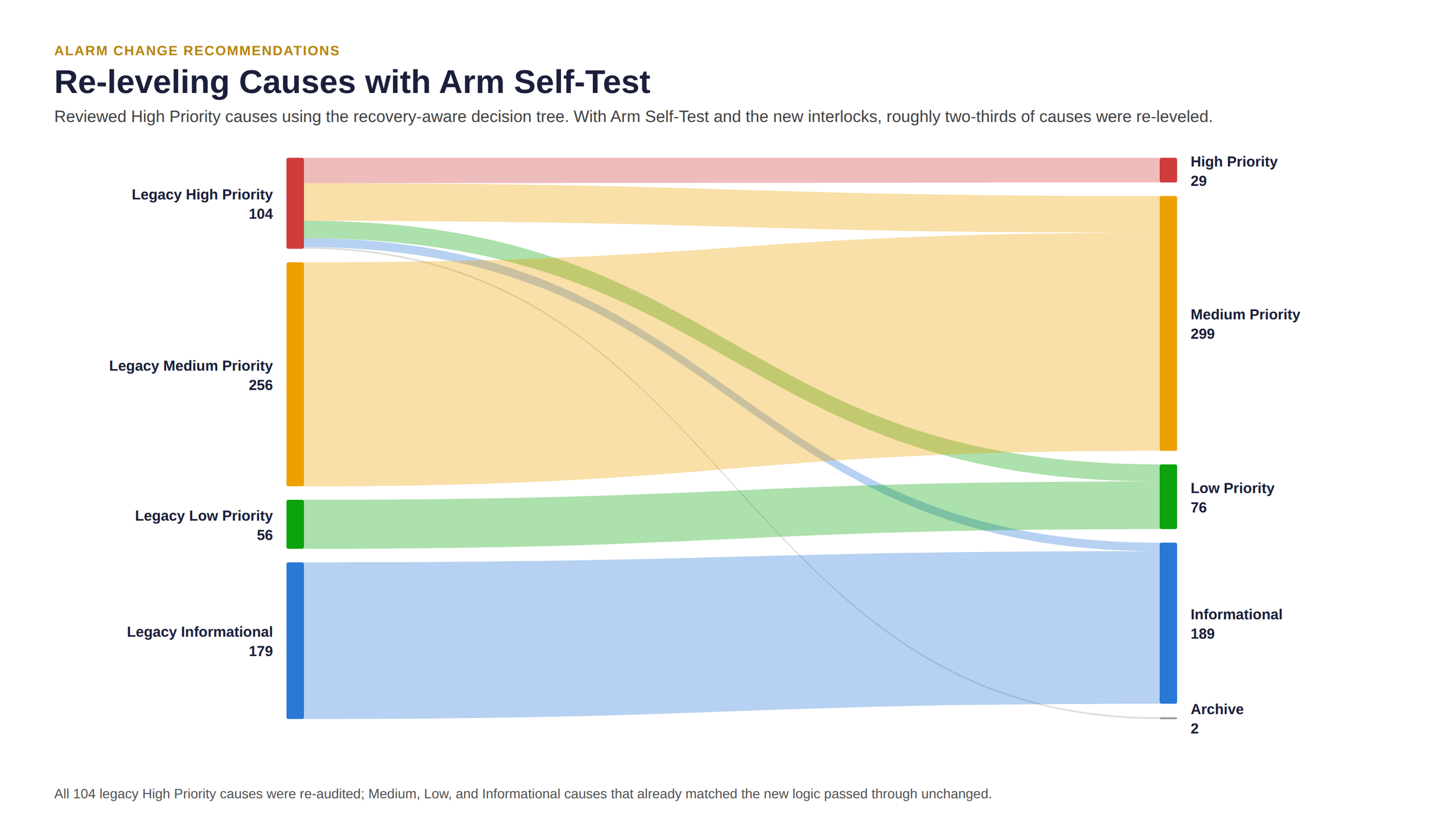
Applying that logic across every legacy cause produced a full redistribution, not an across-the-board downgrade — High Priority causes dropped from 104 to 29, while Medium, Low, and Informational absorbed what no longer belonged at the top.
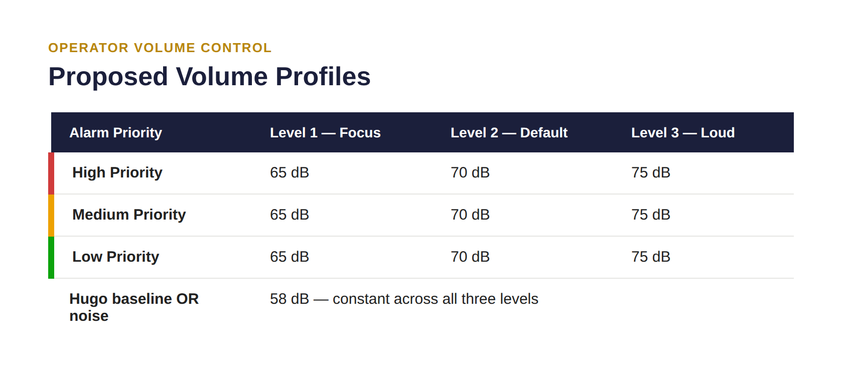
Every alarm had also shipped at a fixed 70 dB regardless of priority or environment; I proposed three operator-selectable profiles instead (65/70/75 dB), all still audible above Hugo's 58 dB baseline OR noise.
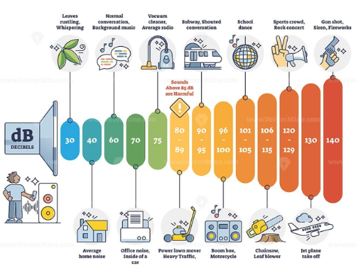
Illustration of typical volume level examples
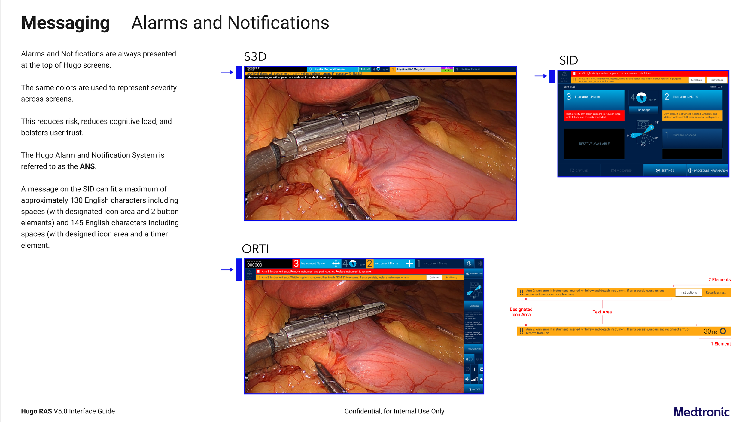
Finally, every change had to be consistently represented on the Surgeon 3D Console, the Surgeon Interactive Display, and the OR Team Interface. I documented the full interaction-state matrix and behavior as part of the handoff.

Results
265 engineering-language notifications were reorganized around the surgeon's real-time decision-making and reduced to 32, cutting cognitive load and keeping surgical teams in a flow state longer.
That redesign generated two patents and shipped as the reference model for notification design across other Medtronic OR products.
High Priority causes cut from 104 to 29 (−72%) once Arm Self-Test's recovery logic invalidated the original priority assignments, so the top tier is reserved for alarms that genuinely require a surgeon's immediate attention.
Roughly two-thirds of all 595 alarm causes were reclassified to match what Arm Self-Test's recovery logic actually requires of the user to take action.
Re-alert interval on persistent High/Medium alarms quadrupled (30s → 2 min), directly reducing repeat-alarm noise during a procedure.
Every priority tier is now traceable to a standardized, regulatory-approved severity definition instead of team-specific judgment calls.
The full audit trail — 368 alarms, 291 failure modes, three linked risk analyses — gave Arm HW, EE, and SW SMEs one shared artifact for the risk-versus-design review, instead of three separate ones.
Post-release SUS score of 69 (n=103 surgeons), up from a baseline average of approximately 54 — moving usability from below the industry-average benchmark of 68 to just above it.
Lessons learned
What I'll carry forward, and what I'd sharpen going forward.
Build UX ownership into the alert copy itself, not just the priority logic. Even with severity mapped to a standardized scale, individual alert text was still written case-by-case — without a UX content pass built into how new alerts get authored, tone and terminology could drift alarm-to-alarm as the system grew, undoing some of what Part One's language work established.
Close the field-data gap before finalizing, not after. Newer platform variants weren't yet represented in the 16,429-procedure dataset, and I shipped anyway on clinical risk alone. Explicitly re-running the audit once it landed would have removed a known blind spot.