Every plant manager had the same training, and they were all stuck at the same wall.
My Role
I was the UX Strategist on DPM, and I worked at three altitudes on the product. I built the Production Dashboard and Action Tracker myself, concept through hi-fi handoff, and set the design direction for the remaining modules, where I directed 4 UI designers who executed them. Alongside that, I designed and led the research strategy: on-site deep dives at two plants, remote usability testing, and prototype reviews. We contributed to the shared PTC design system.
problem
A hundred machines. Only ten mattered. OEE can’t tell them which.
The stated problem: manufacturers stuck around 60% OEE, chasing an 85% goal. The deeper problem: OEE could tell them that they were losing productivity, but not where. *OEE = Availability x Performance x Quality.
OEE is a percentage, measured after the fact, and everyone had the same Six Sigma training, so they were all optimizing the same visible things. The real constraints stayed hidden. In a plant with a hundred machines, maybe ten are actually throttling throughput, and teams were routinely pouring effort into the other ninety, which never moved the P&L.
They didn't know what they didn't know, because their tools couldn't show it to them. What DPM brought was real-time data that surfaced those hidden bottlenecks, plus a common unit, lost hours, that let them be ranked by impact and acted on.
deep dive
They could measure the loss but they couldn’t locate it.
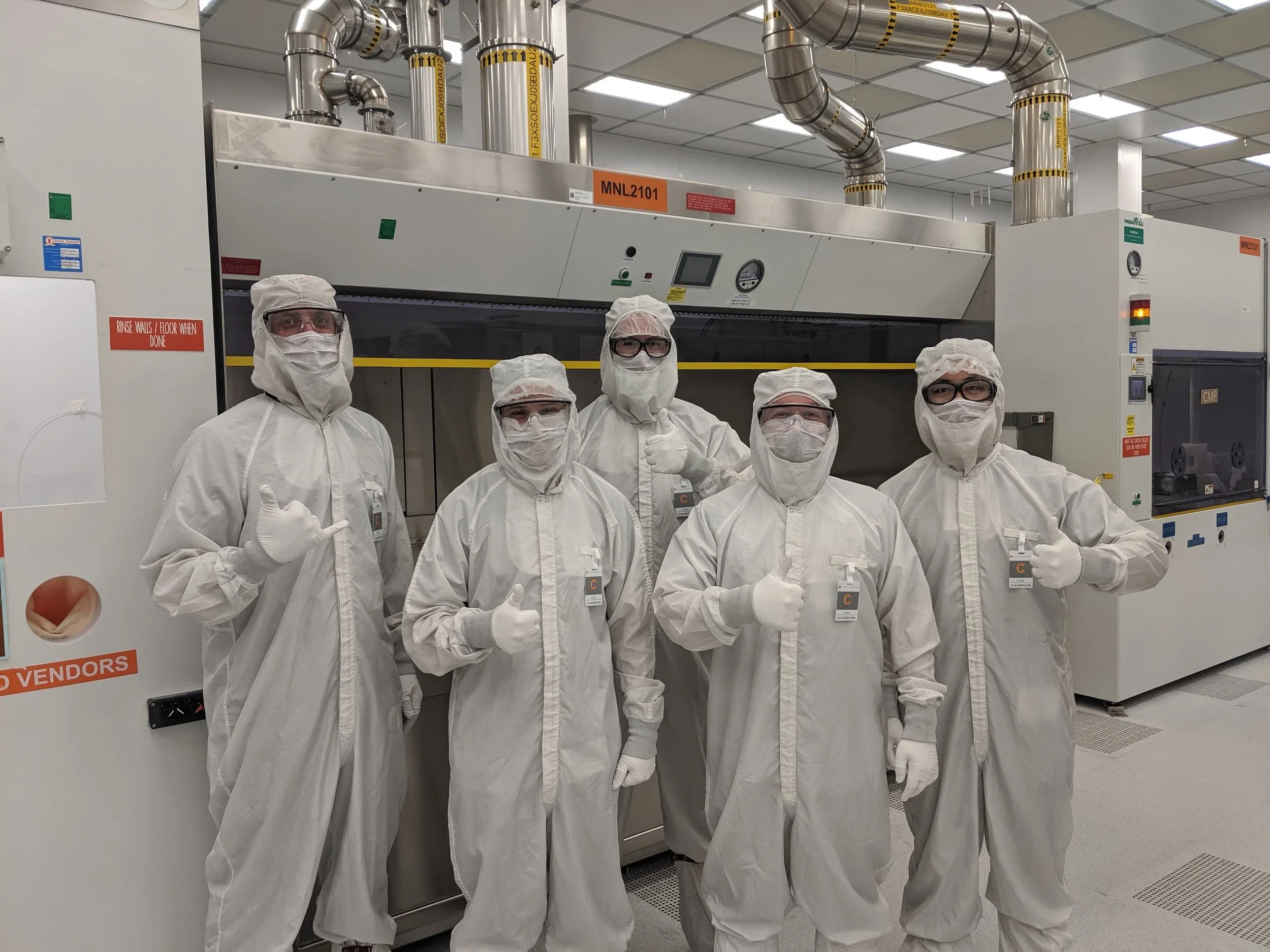
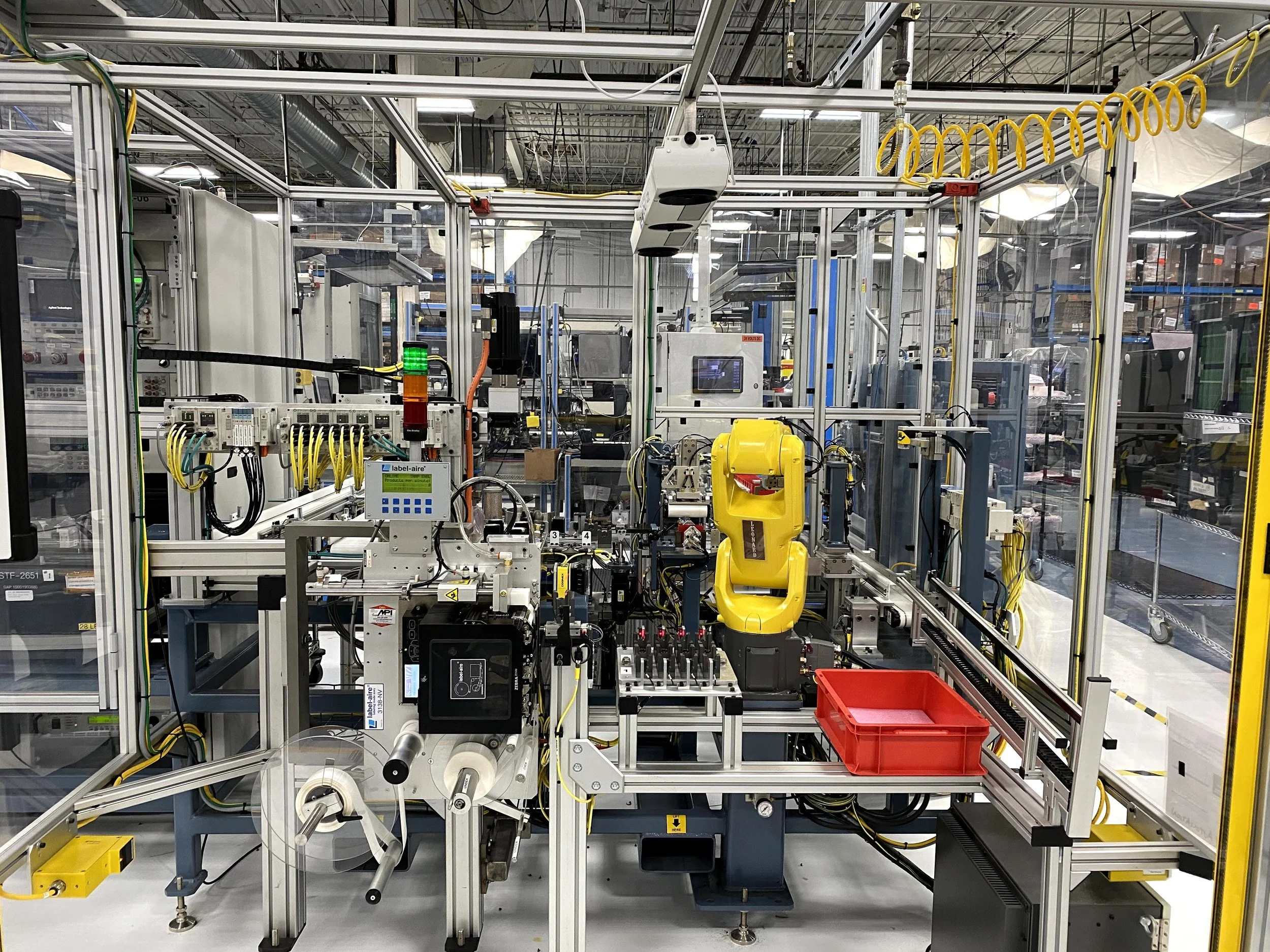
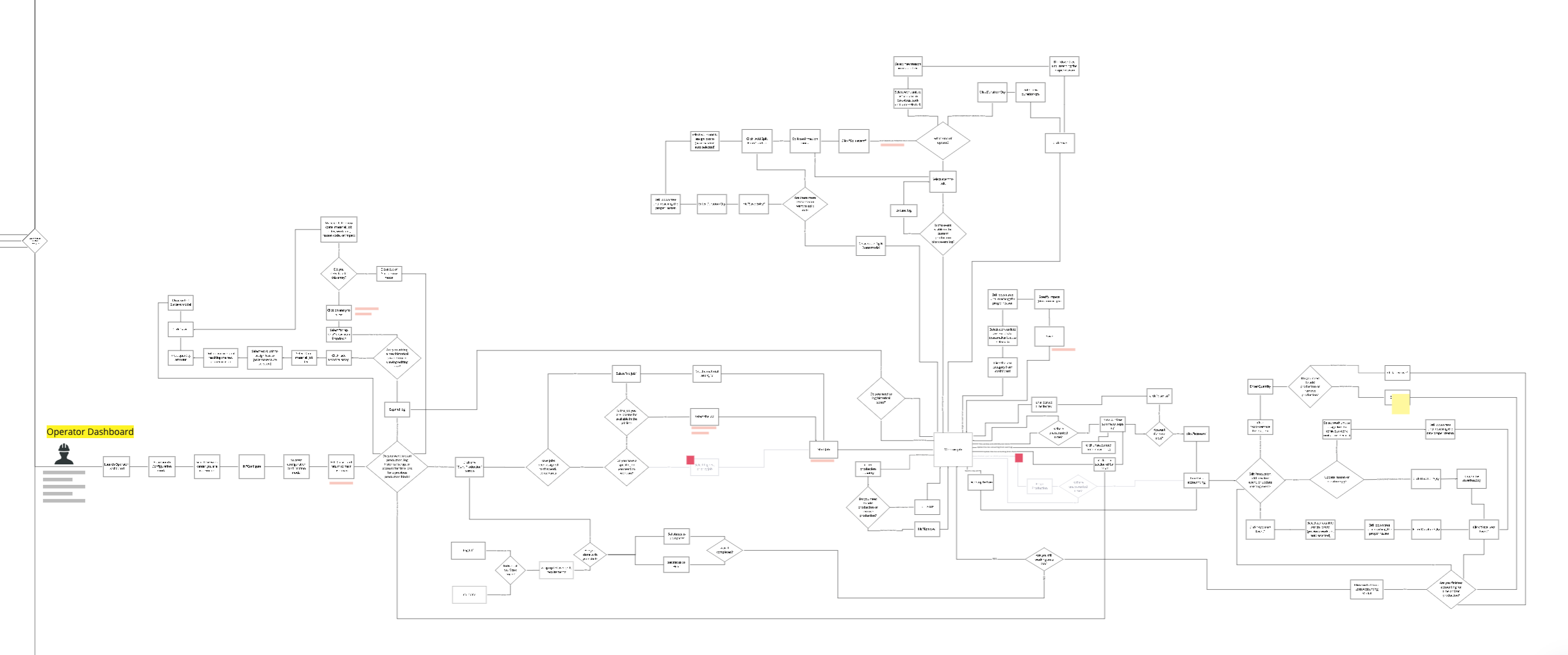
Rather than working from secondhand data, I mapped the plant floor processes end to end, and turned a co-development partnership with Rockwell Automation into real access, running on-site deep dives at a live plant along with continuous remote SME interviews.
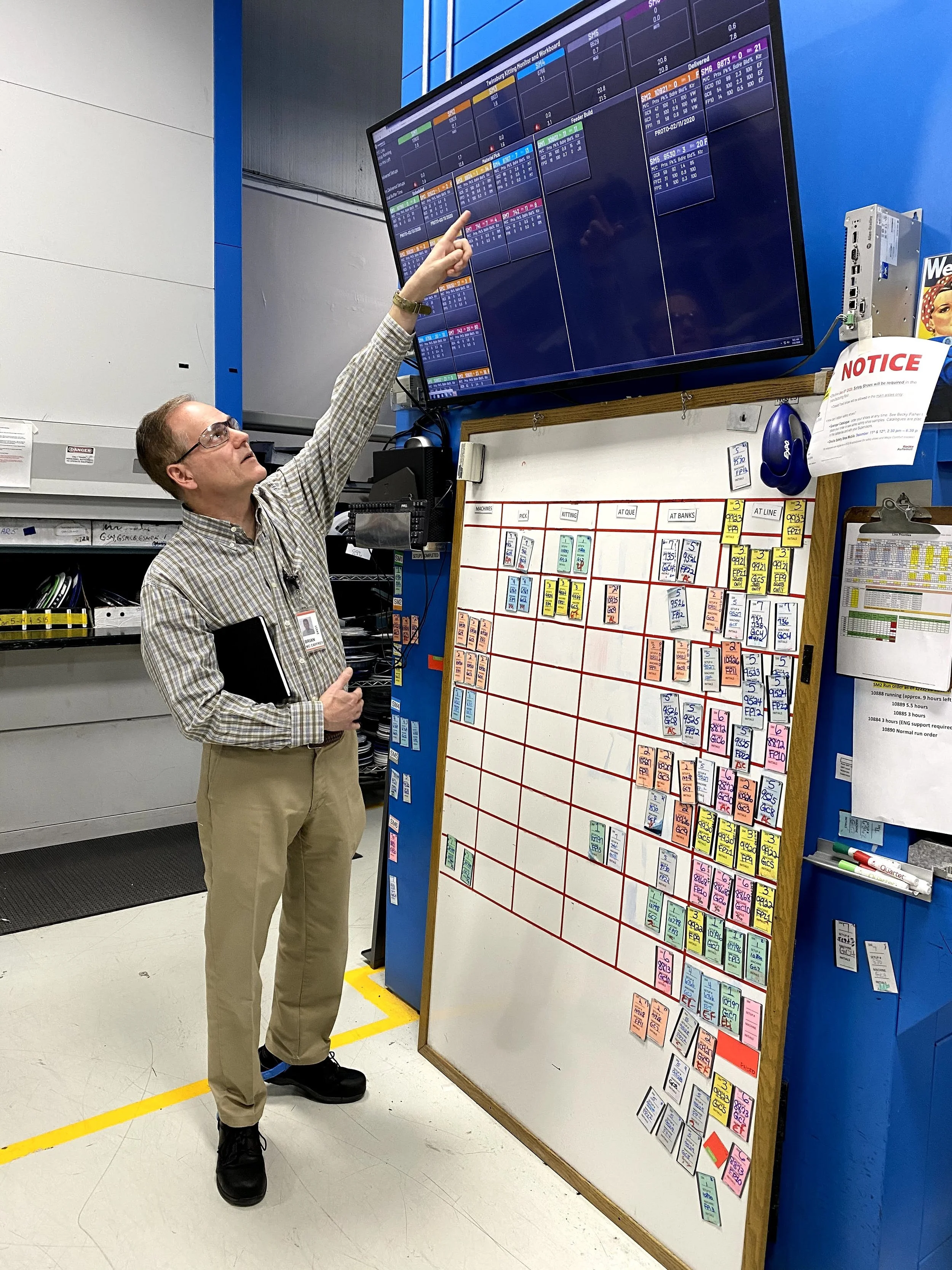
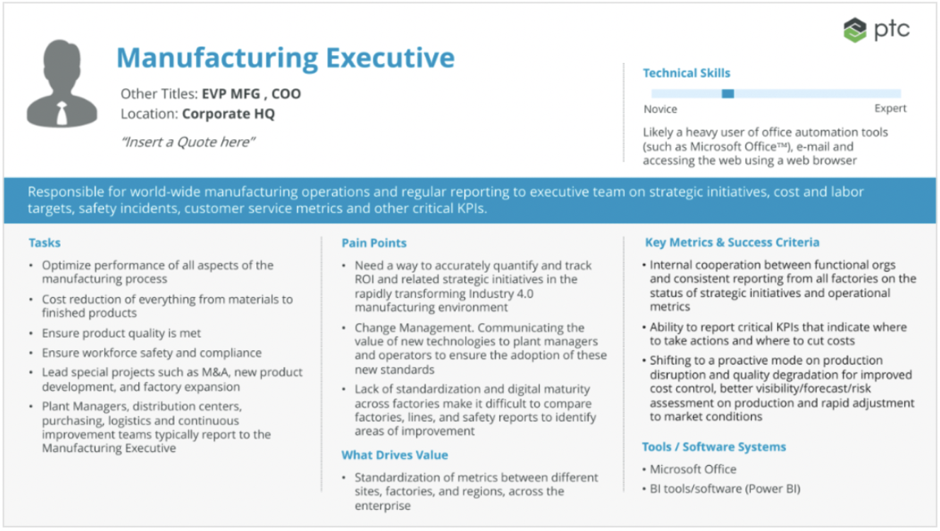
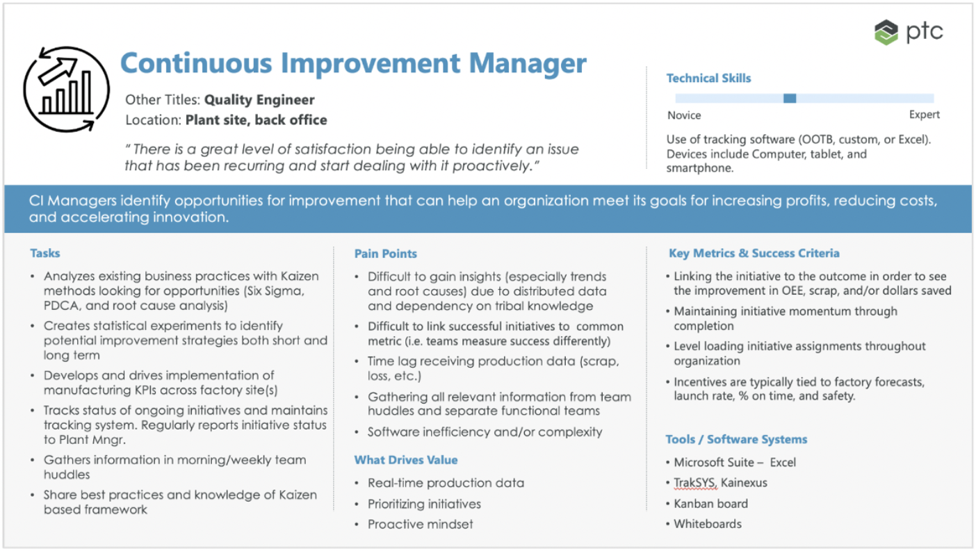
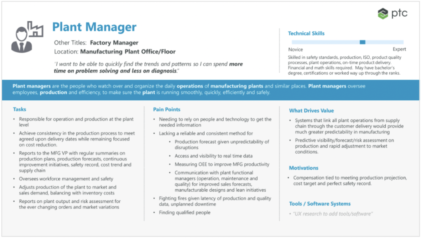
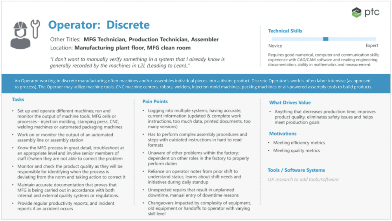
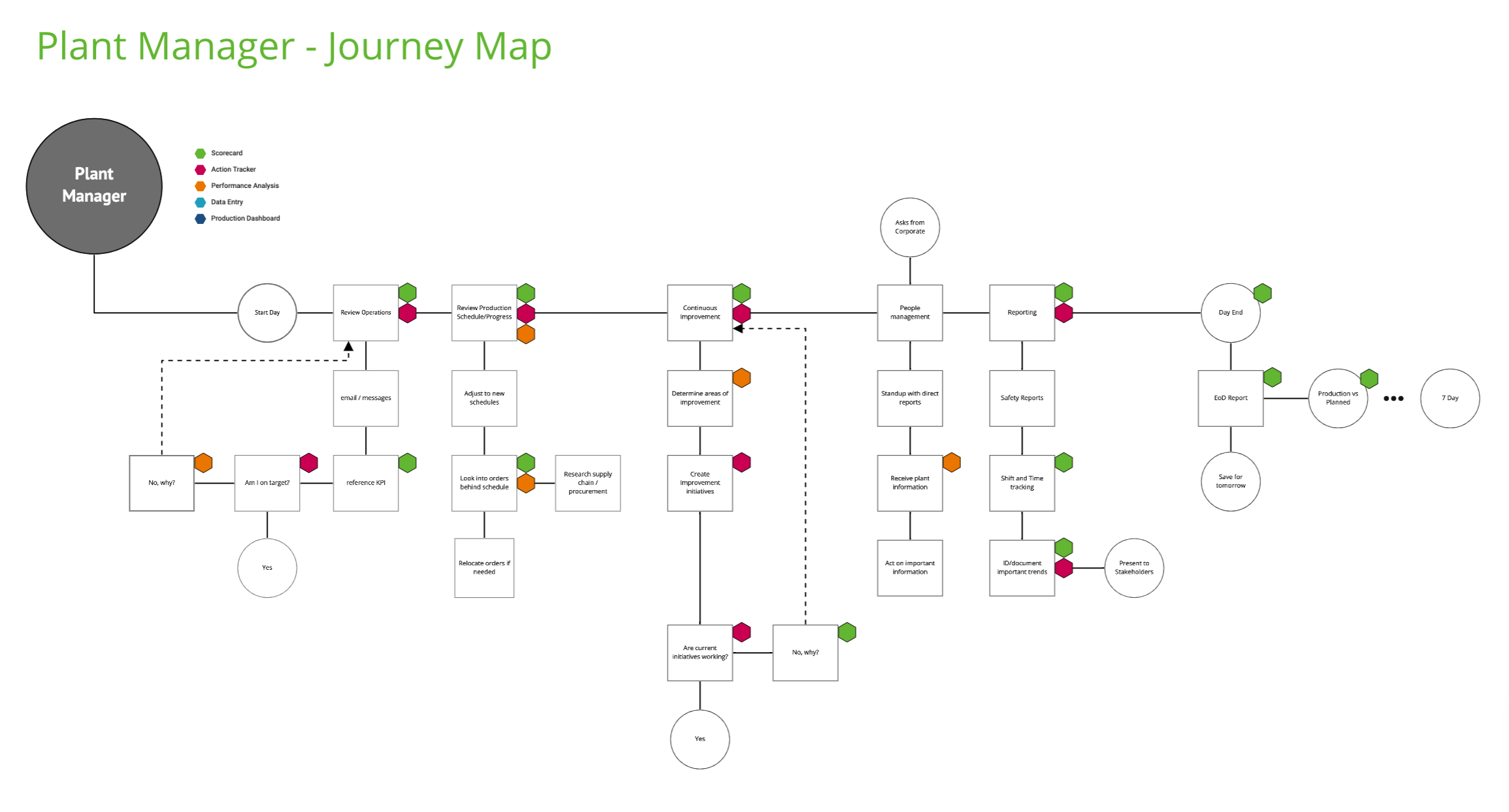
That research produced personas grounded in the real roles, and a journey map of the continuous improvement lead's week. The map ended the same way every time. They could name how many hours they were down by, but they couldn’t understand where the hours were going, or why.
They could measure the loss but couldn’t locate it or prevent it.
ux hypothesis
They didn’t need another dashboard that showed them failing
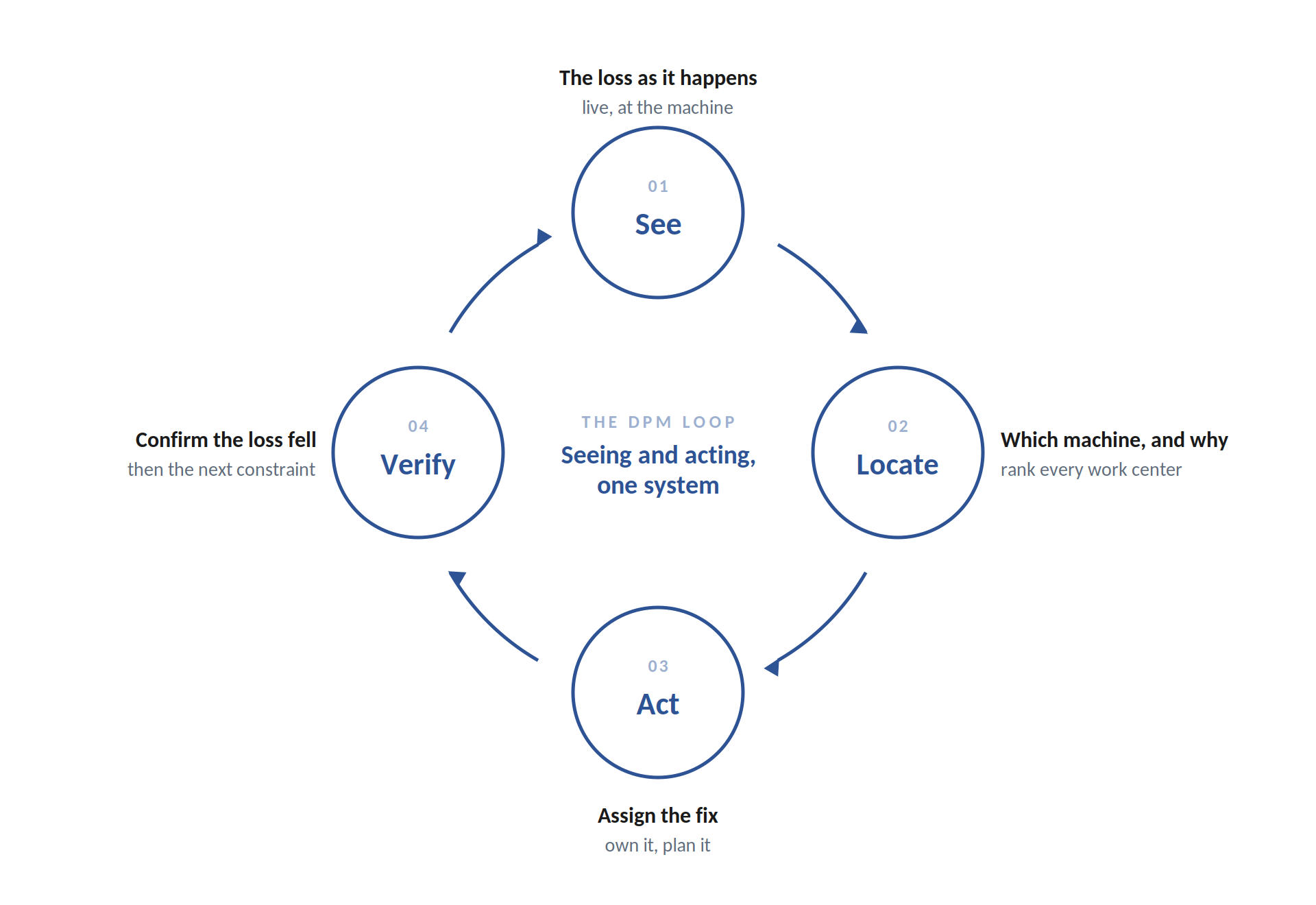
A tool that only reports leaves you exactly where you started. These teams could already see that performance was off. What they could not do was act on it, then know whether the action worked. So the principle was simple. Seeing and acting had to be one system, not a report with a to-do list stapled to it. Finding the bottleneck, assigning the fix, and tracking the result had to be one continuous loop. That principle is what everything else was built on.
A report wasn’t enough. I designed dashboards, but not ones that simply report failures. DPM ensures accurate data goes in and locates where the loss hours are going, it then lets you act on the cause, and tells you whether a corrective action worked.
Making the loop real
One Loop. Enter and see the loss, locate it, close it.
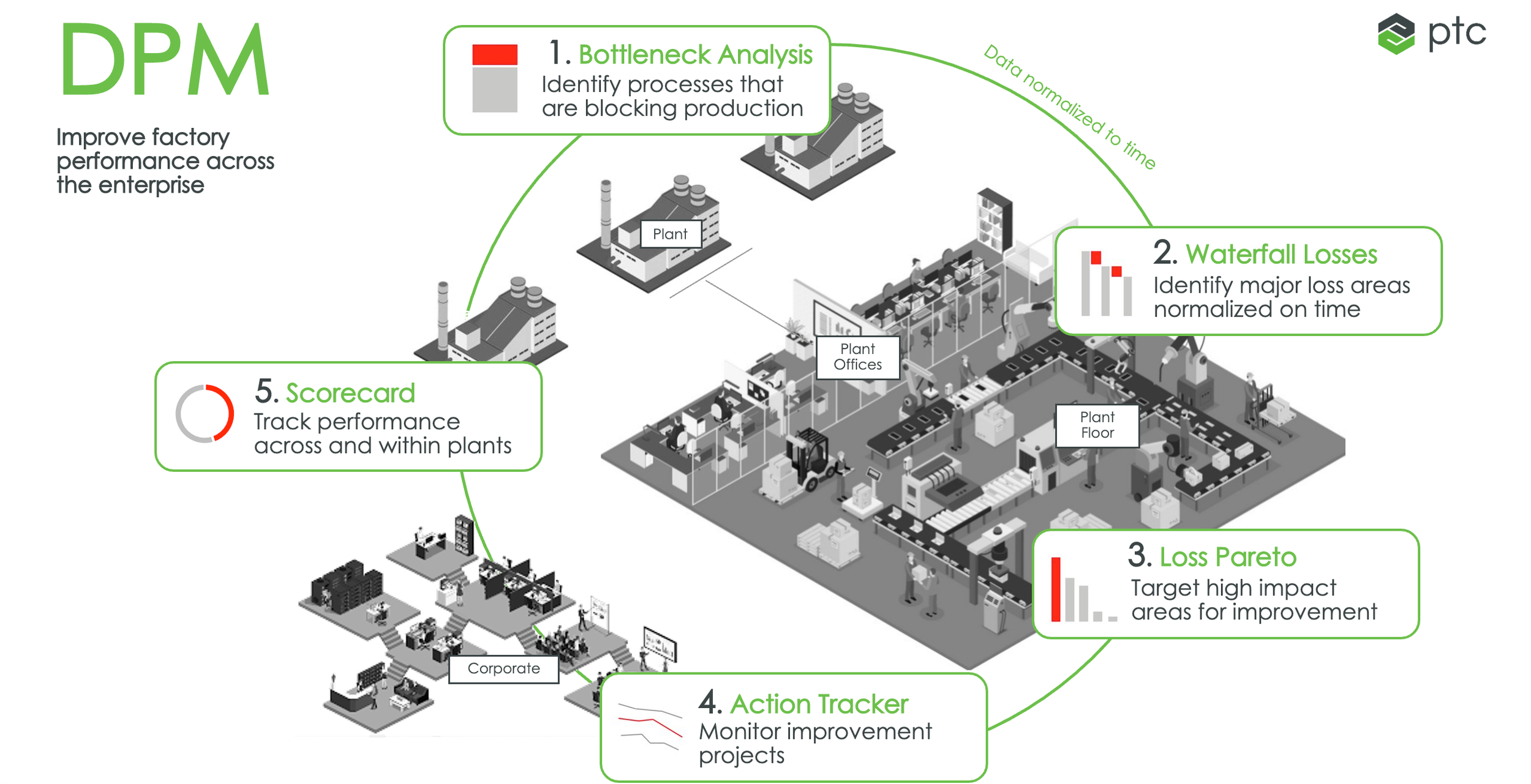
I designed the dashboard. Not one that only reports, but one built as a closed loop: capture and see the loss where it happens, locate the constraint causing it, and act on it until the data confirms it is gone. Here is that loop in product, in the order a plant team actually moves through it.
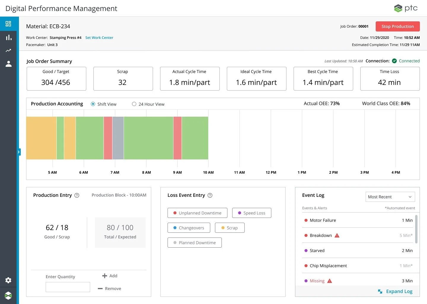
01- Operator dashboard. Capture the loss as it happens, at the machine with human-in-the-loop confidence. Actual against target for the current shift, losses logged as they occur. This allows users to see the data captured at the point of work.
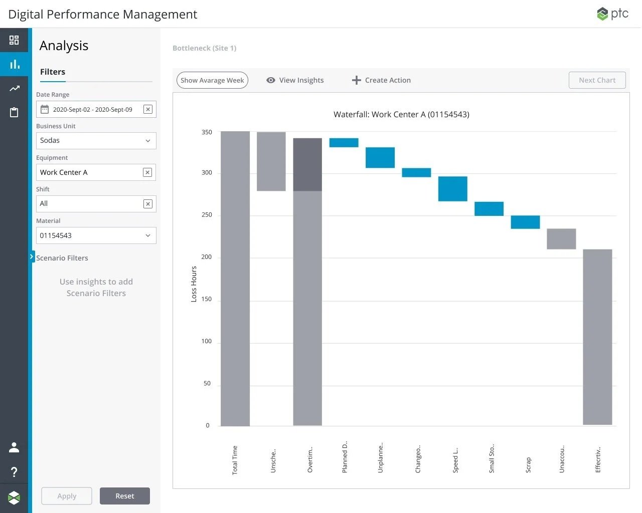
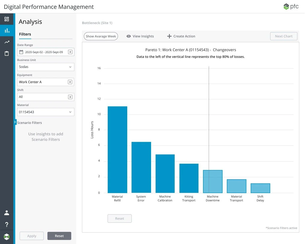
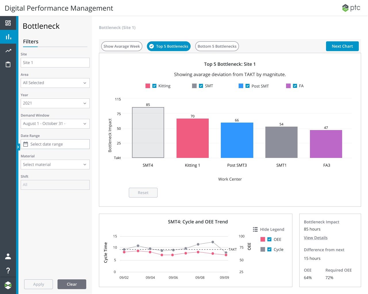
02 - Waterfall, Pareto, and Bottleneck charts. Step back, and locate which area or machine is actually costing you. Every work center over a demand window, ranked by impact. The losses are located.
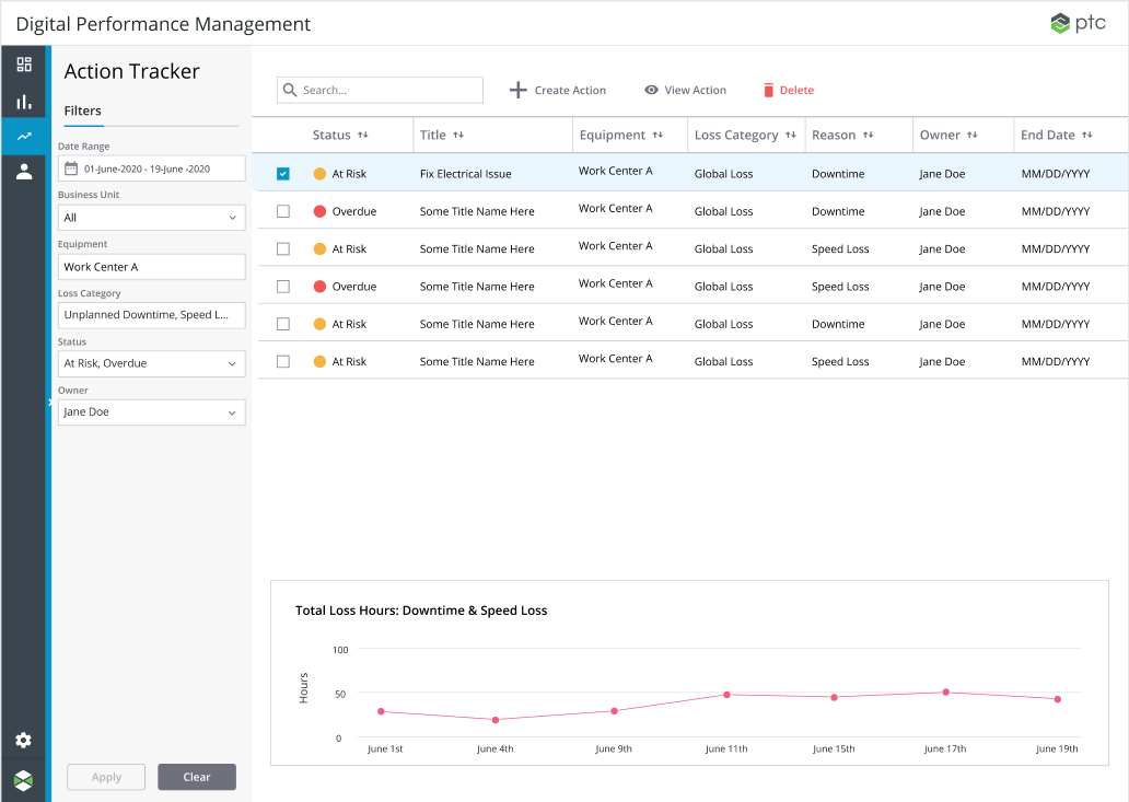
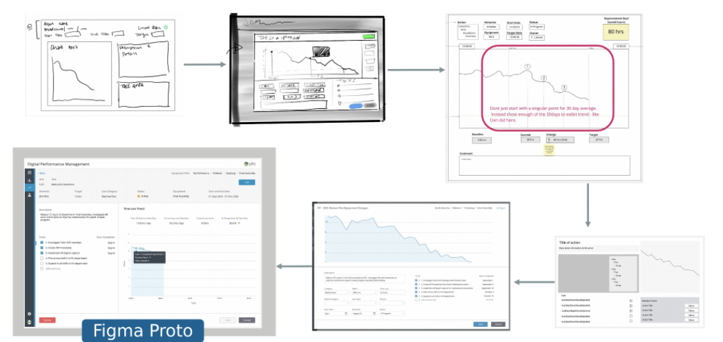
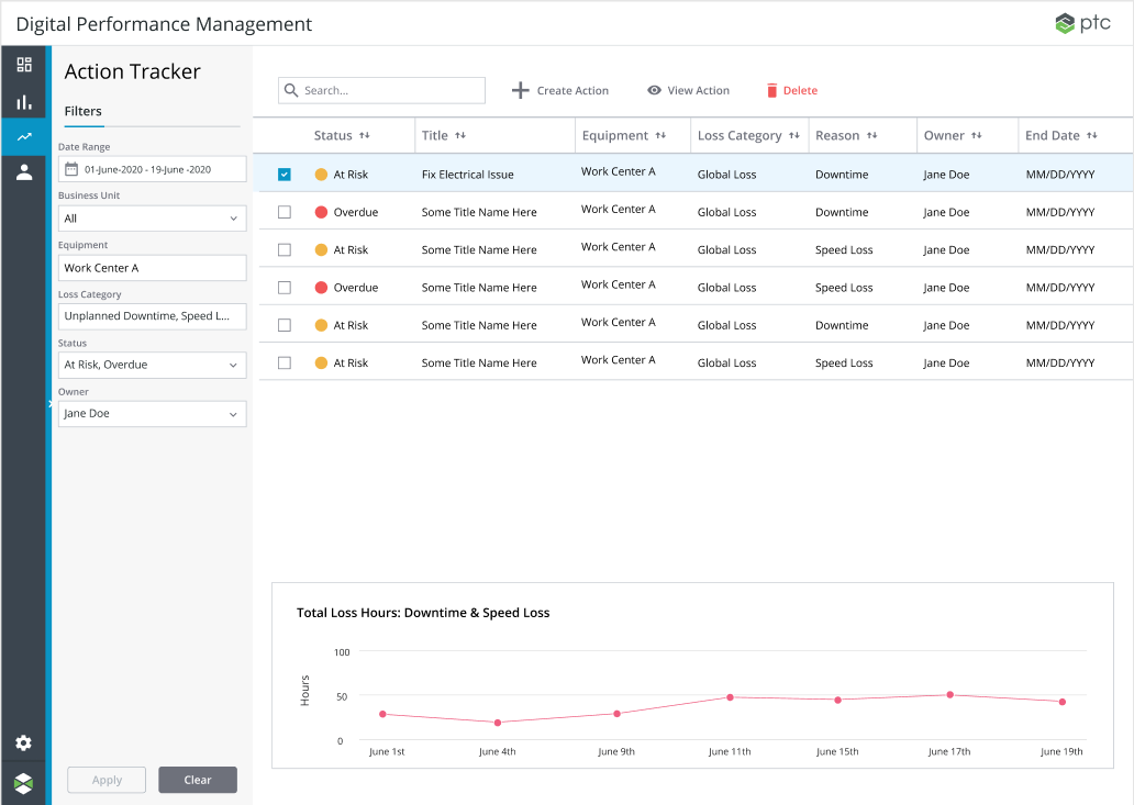
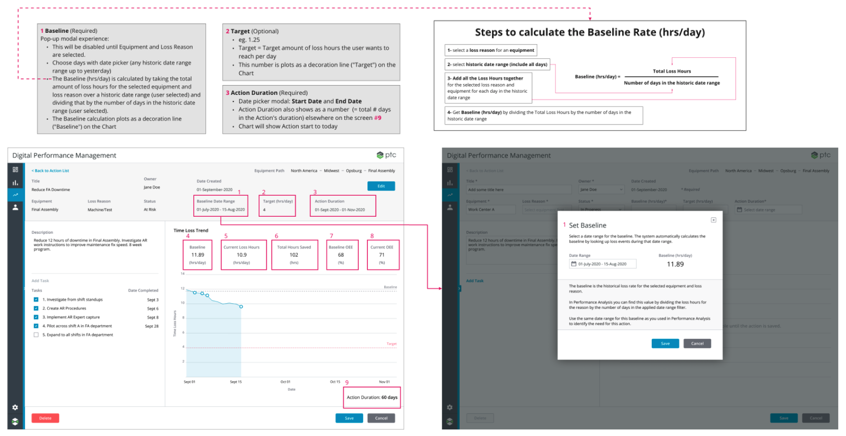
03 - Action Tracker - Create an Action. Assign corrective actions to a worksite or loss category of interest. Create plans and milestones associated with the actions.
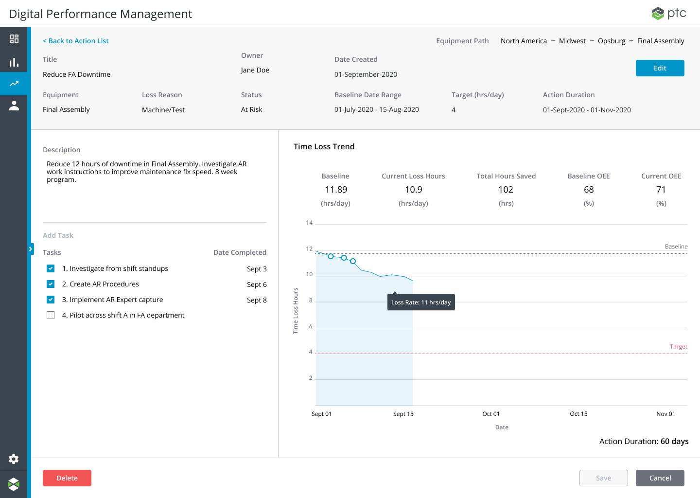
04 - Action Tracker - Track and verify. Monitor the corrective actions over time. Confirm that the loss fell. All factory sites have access to actions, providing a transparent and scalable solution.
Proven at a live plant
After launch, PTC reports that Thermo Fisher recovered double-digit OEE.
The goal was to recover hours no one could see and turn them into throughput. That is the standard PTC now sets for DPM: reaching for double-digit OEE gains and up to 20% more effective time.
I took DPM from a loose concept to a validated MVP, the full see, locate, act, verify loop, working under production conditions at a live Rockwell Automation site. Not a demo and not a mockup. We created a live system that could actually run.
The product delivers the gains it was initially built for. Thermo Fisher claims that DPM reached 75% of its yearly target in only 6 months, which ties back to millions in revenue.
the lesson
I over-designed before I under-designed.
Displaying complexity often surfaces noise. Hiding complexity is solving complexity.
Early on, I tried to make the bottleneck visualization prove how sophisticated the underlying analysis was. I experimented with spider charts, violin plots, and other novel statistically rich formats that showed MORE data, like distribution, variance, multiple dimensions of data layered together.
These looked impressive, but they were wrong for the job. They tested poorly. For example, when we put a spider chart comparing cycle time against OEE in front of plant managers, 4 of 5 had difficulty interpreting it. They could see the shape, but they couldn't quickly translate that shape into meaning. Every one of the richer formats added a decoding step between the data and the decision. That delay, compounded across factory ecosystems, scales up to meaningful time.
If I were to do this again, I would skip the instinct to impress with visualizations and test the simplest versions first. My mistake was not experimenting with other formats. It was ASSUMING richer meant better. Now I default to and test the simplest possible versions first and only add complexity if the simple versions fail to convey something the user needs. What worked was going simpler than felt comfortable.